Virtual Photo Album for ex-Pope Benedict XVI Mocked Over Comic Sans
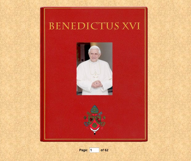
Benedict XVI officially resigned yesterday after eight years as the Pope of the Catholic Church. The Vatican decided to commemorate his papacy by publishing a digital photo album to its website. It’s a serious set of photos that marks a serious occasion, but it’s attracting attention for the wrong reason: most sites that are reporting on it seem to be focusing on the font selections rather than the images themselves.
The text in the album is Comic Sans and the watermarks on the photos are Papyrus.
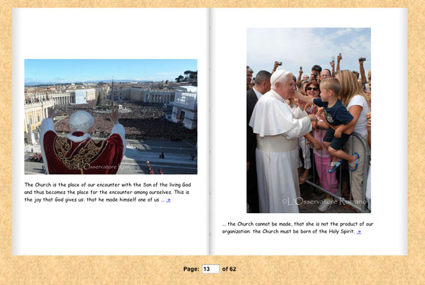
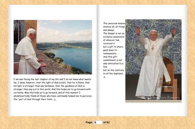
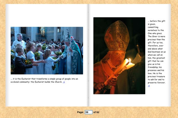
The 62-page album is loaded with photographs from the Holy See’s newspaper, L’Osservatore Romano. Each page features a photograph of Benedict XVI engaged in duties of his position, from standing before crowds of people to visiting foreign lands.
Alongside the photographs are short quotes from his sermons and writings — quotes that are displayed in the much-mocked and widely-reviled Comic Sans font.
The Verge writes that it’s “a font typically associated with children’s birthday party invitations rather than papal resignations or God Particle pursuits.”
Comic Sans, popular during the mid-1990s, has been sworn off by most web designers as a childish and inappropriate font for most purposes. Regardless of your feelings toward the font everybody loves to hate, it may be tough to argue with a little thing called papal infallibility.
[…] one would think the Vatican would have more dough to spend on a Web designer. The pope’s scrapbook looks like something out late-90s Geocities, utilizing the much-maligned comic sans font to provide caption captions for each picture.
Sadly, all the pictures in the world of the ex-Pope leading mass, kissing babies and wearing hats can’t hide the fact that it seems like someone actually made it in the early 90s. This thing is a mess of textured backgrounds, comic sans, awful page turns, and a page jump feature that looks like it was coded by a child.
Lesson learned: if you plan on releasing a serious collection of photographs on the Web, make sure you pay careful attention to how it’s packaged (and what font you use) — people pay attention to those things.
You can browse the virtual photo album yourself here.
P.S. Interestingly enough, the Wikipedia article on Comic Sans has a whole section dedicated to opposition to the font’s use.